
Most businesses spend significant resources driving traffic to their websites. They invest in SEO, paid ads, content marketing, and social media. Yet the average website converts only 2 to 5 percent of its visitors. The remaining 95 percent leave without taking action.
The question is: why? And more importantly, what can you do about it?
Heatmap tools are one of the most direct ways to answer that question. Rather than relying on aggregate metrics like bounce rate or average session duration, heatmaps show you actual user behavior on a visual level. You can see where users click, how far they scroll, and where their attention is focused.
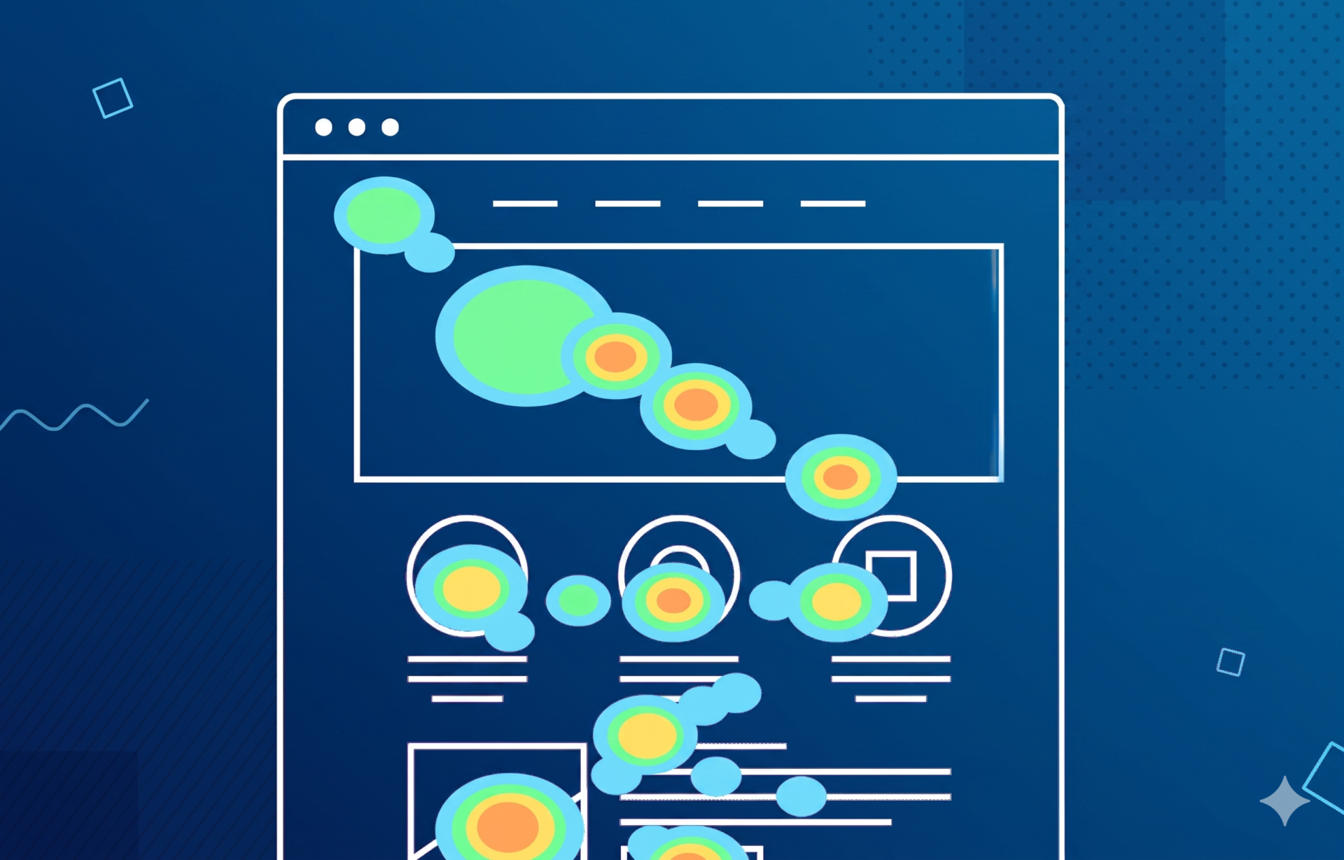
A heatmap tool tracks and visualizes how users interact with individual pages on your website. It overlays a color-coded map on top of your page, where warmer colors (red, orange) indicate high activity and cooler colors (blue, green) indicate low activity. The name comes from thermographic imagery, adapted here to represent user attention rather than temperature.
Unlike Google Analytics, which tells you that a page had a 70% bounce rate, a heatmap tells you that the majority of users never scrolled past the hero section, or that they clicked on an image that was not a link. These are fundamentally different types of insight, and they lead to fundamentally different optimization decisions.
KEY POINT Heatmaps answer the “where” and “what” of user behavior. Combine them with session recordings and user interviews to also understand the “why.”
Most heatmap tools offer several distinct visualization types. Understanding what each one measures helps you choose the right one for a specific question.
Click maps show where users click on a page. Every click is recorded and aggregated into a visual overlay. This reveals whether users are clicking on intended elements (buttons, links, CTAs), clicking on non-interactive elements they expect to be clickable (such as images or headings), or completely ignoring your primary call-to-action.
EXAMPLE An e-commerce brand discovered through a click map that 28% of users were clicking on a product photo expecting it to open a larger view, but nothing happened. Adding a zoom feature reduced the drop-off rate on product pages by 18% within two weeks.
Scroll maps show how far down a page users scroll before leaving. Each horizontal band on the page is color-coded based on the percentage of users who reached that point. Scroll maps are particularly valuable for landing pages and long-form content, where the placement of your CTA relative to average scroll depth can make or break conversions.
KEY POINT If your primary CTA is placed below the point where 60% of users stop scrolling, you are losing a significant portion of potential conversions regardless of how compelling your offer is.
Move maps track cursor movement across the page. Research shows a moderate correlation between where users move their mouse and where their eyes are focused, particularly on desktop devices. Move maps can indicate which headlines and sections attract the most attention, even when users do not click.
Rage clicks are rapid, repeated clicks in the same spot, typically a sign of user frustration. Most modern heatmap tools can filter and visualize these separately. Rage click hotspots often point to broken links, slow-loading interactive elements, or interface elements that look clickable but are not.
Attention maps combine click and scroll data to estimate where users spend the most time on a page. They provide a more complete picture of engagement than click maps alone and are useful for evaluating the effectiveness of content layout.

There are several strong options on the market, each with different strengths depending on your team size, budget, and technical setup.
| Tool | Free Tier | Session Recordings | A/B Testing | Best For |
| Hotjar | Yes (limited) | Yes | No | Mid-size sites and agencies |
| Microsoft Clarity | Yes (unlimited) | Yes | No | Tight budgets, small teams |
| Crazy Egg | No | Yes | Yes | Teams wanting built-in testing |
| FullStory | Yes (limited) | Yes | No | Enterprise / complex products |
| Lucky Orange | Yes (limited) | Yes | No | E-commerce with live chat |
| Smartlook | Yes (limited) | Yes | No | Web + mobile app tracking |
Microsoft Clarity is free with no session limits and integrates natively with Google Analytics, making it an excellent starting point for teams with limited budgets. Hotjar is the most widely used option and combines heatmaps, recordings, surveys, and funnel analysis in one platform. Crazy Egg stands out for its built-in A/B testing editor, which removes the need for a separate testing tool.
Installing a heatmap tool takes minutes. Getting meaningful results takes a clear process.
After analyzing hundreds of websites, certain heatmap patterns appear repeatedly. Here is what they typically mean and how to respond.
If your click map shows concentrated clicks on images, headings, or decorative elements that have no link, users expected an interaction that was not there. Either make the element clickable (link the image, add a CTA) or redesign the element so it does not signal interactivity.
EXAMPLE A SaaS company noticed that 34% of homepage visitors clicked on a feature icon grid that was purely decorative. They added links to dedicated feature pages, resulting in a 22% increase in feature page visits and a measurable improvement in trial signups.
If scroll maps show that only 30% of users reach the section where your primary CTA sits, you have two options: move the CTA higher on the page, or add a secondary CTA earlier in the content that serves users who are ready to convert without reading everything.
If click and move maps show minimal engagement with your hero section, it often indicates that the headline does not match visitor expectations, the visual hierarchy is unclear, or the page loads slowly and users scroll past it before it renders. Review your messaging first, then check page speed.
Desktop and mobile heatmaps frequently tell completely different stories. Mobile users tend to scroll faster, tap on larger elements, and abandon multi-step forms at much higher rates. Always review mobile heatmaps separately and treat mobile UX as a distinct problem to solve.
KEY POINT In most markets, more than 60% of web traffic comes from mobile devices. If your heatmap analysis is based only on desktop data, you are optimizing for the minority of your audience.

Heatmaps tell you what is broken. A/B tests tell you whether your fix actually works.
Heatmaps are diagnostic tools. They identify symptoms, such as a button that is being ignored or a form that users abandon after the third field. They do not prove that a specific change will improve conversions. That is what A/B testing is for.
The most effective CRO workflow uses both together. Use heatmaps to identify a problem, form a hypothesis about the cause, design a variation that addresses it, and then A/B test the variation against the original. Heatmaps on both variants then confirm whether user behavior changed in the expected direction.
EXAMPLE Heatmap finding: only 12% of users scroll to the pricing section. Hypothesis: users need pricing information earlier. Action: add a pricing summary block in the hero. A/B test result: 31% increase in clicks to the pricing page and a 9% lift in free trial signups.
Heatmap tools are one of the most practical ways to move from opinion-based decisions to evidence-based optimization. Used correctly, they bridge the gap between what you think users do and what they actually do.
Ready to improve your website conversions? We help businesses identify and fix conversion barriers using behavioral data, UX analysis, and structured testing. Get in touch to discuss a CRO audit for your website.